Equilibrium
When Dylan, a prior contestant of Australian Survivor, reached out to get help branding his new game, I was intrigued. The premise:
“Keep the Balance - Claim the Crown”
The online, multiplayer strategy game plays on the balance of light and dark so it was crucial the logo captured that same contrast.
The client also asked for a logo, an intro video card, social header and profile picture.
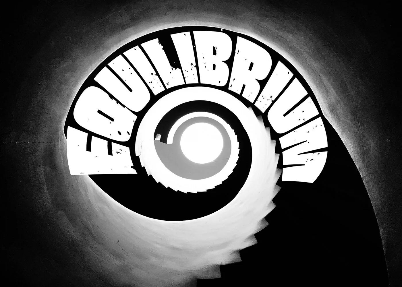
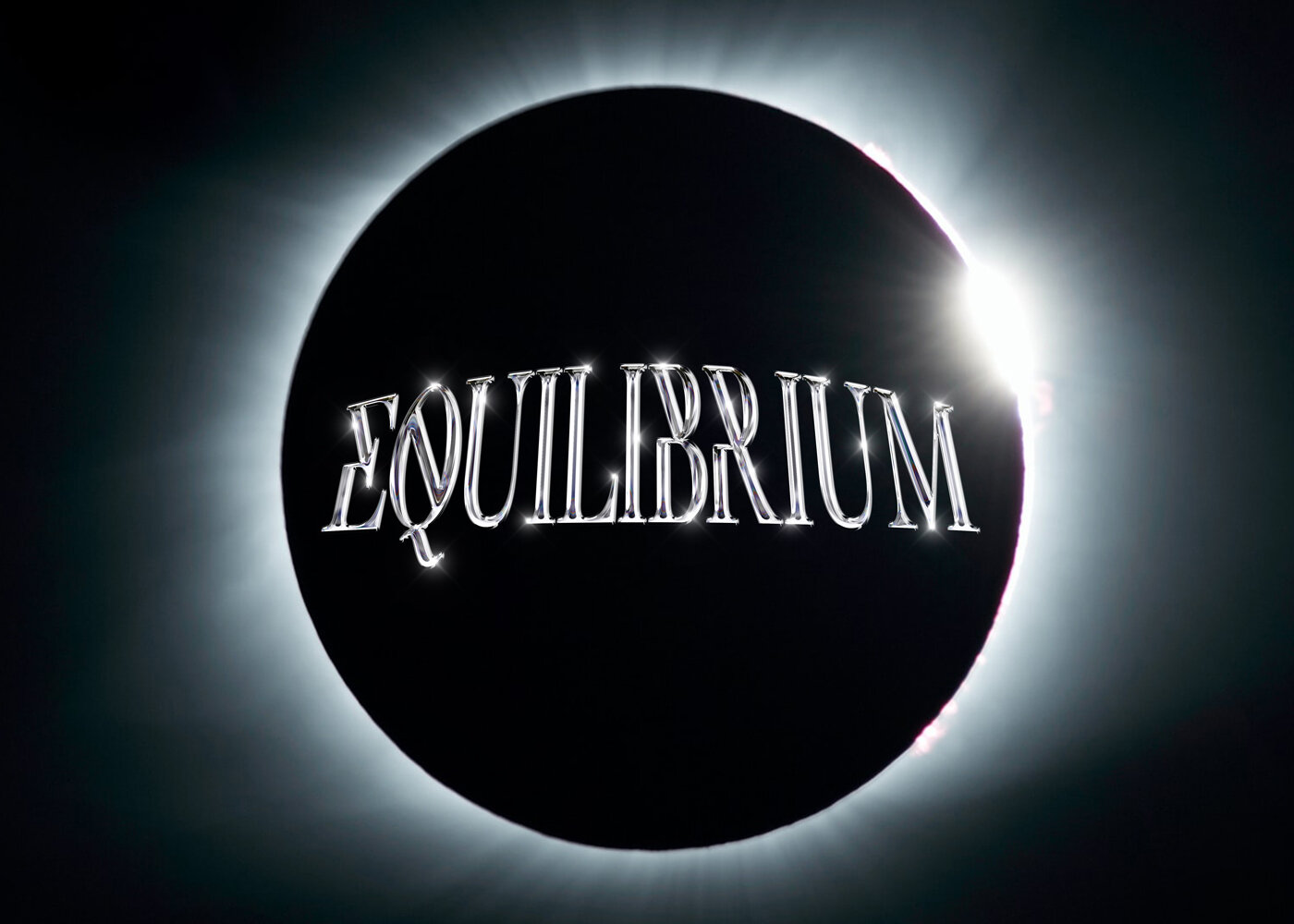
Dylan was interested in exploring block letters, negative space, and punchy black & white concepts. We started with the four concepts above.
Dylan gravitated towards the type treatment above and ultimately fell in love with the eclipse motif. We decided it was strong enough to bring back and bake into the logo! I compiled a series of transparent gradient glows and color overlays to get that perfect halo (below). Then played around with the text warp and perspective.
In this round of refining we also played with adding sharper edges to the letterforms (iterations 1-4 in the series above)
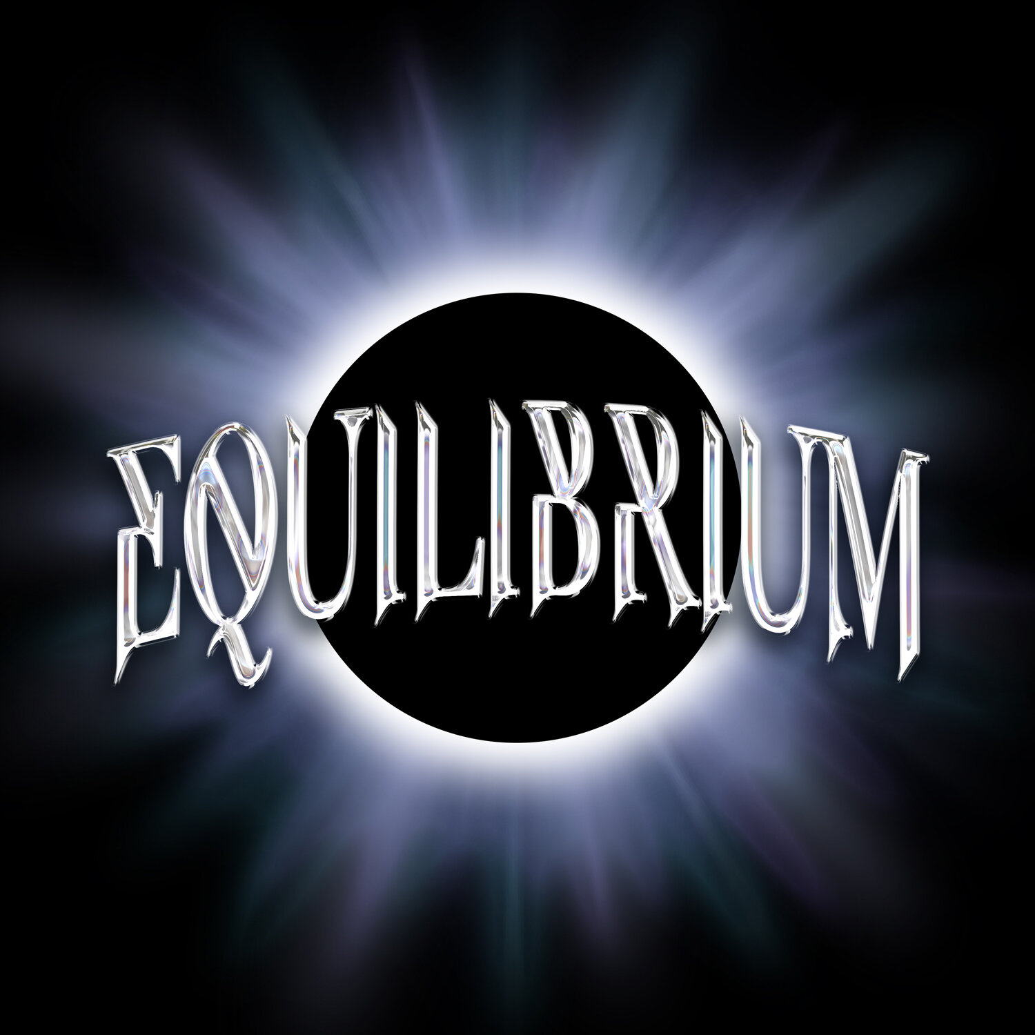
The design below is the final logo for Equilibrium! You can see I brightened the chrome effect on the text quite a bit and added flecks of green and purple to the rays to saturate the atmosphere and liven it up.
It’s not often that I get to play with transparent glows in logo designs. The moment I created those rays I wanted to animate them! The resulting effect made a great loading screen for the client.


